
I was thinking about what I should write about for this blog post. Well, rather than another mundane post about the technology that is floating around (although I do love what I have written about that) I thought “Hey! Why not talk about what we all love most? Yarn!” We all know about fiber-type, weight and technique, but how many of us are paying attention to color?
Are the combinations we use working? Are they trendy?
Let me insert a business moment here, if a color isn’t “hot” who is going to buy it?
This is where we need to take a look at the color here.
This website shows the trending colors for each season; remember, most fashion is one or two seasons ahead of the actual season, create accordingly.
Don’t be afraid of embracing color. Leave taupe, white, and tan at the door, embrace the bright, exciting colors. What is going to look great on the front page? (we will all get there someday)
If you try something, the worst that will happen is that you will hate it and you rip it out and do a different project.
Now I am not saying completely leave the neutral tones, because there are buyers who will buy it. Also, those colors can be used in striking ways.
These are a few examples that I took directly from our team :-)

I absolutely love the combo here in this cuff by Anadiazarte ; the striking sand tone in the middle of a deep blue really makes the entire piece pop. that gradual richening of color to the center really draws the eye to the focal point of the wrapped bead.
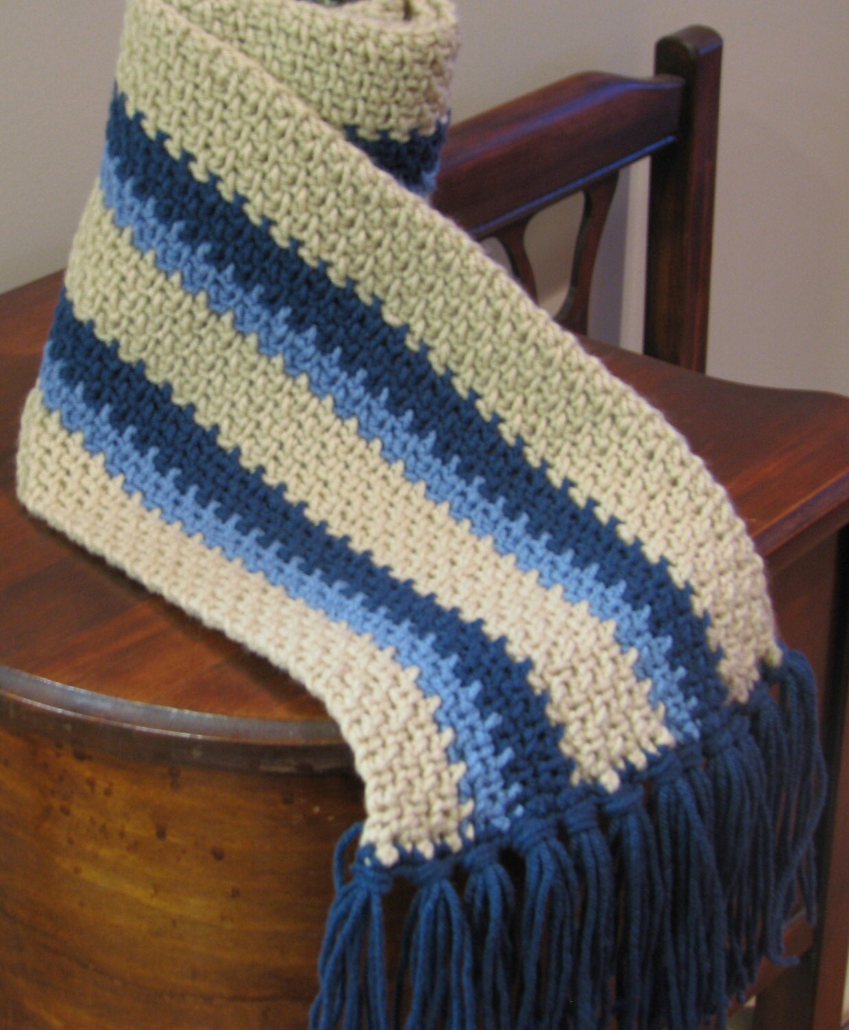
This scarf by CatsCrochetCorner shows that tan can be used as a primary color in a trendy modern way. this particular use makes the scarf feel hip and mature. The balance of the blue with the tan gives me a sense of cleanliness. I'm not sure why per se, but it looks good!
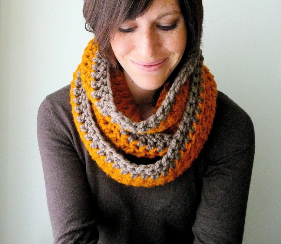
This Circle scarf by lainedesign uses rich warm tones to heighten the coziness factor here. An orange "persimmon " attracts the eye, but the nutmeg brown tones it down to a more manageable combo. If this had been only persimmon, I would venture to believe that it might be too much, but with this pairing, the colors work together in harmony.
There are dozens and dozens of great color combos in this team, and it would take days if not weeks and months to post why I like each one haha.
Keep the hooks goin'
-Benjamin Krudwig
6 comments:
Benjamin!, thank you so much for including my AMULETO Bracelet/Necklace in this post. I agree with you in how to use color when creating a piece, we have great talent in our team.
great post! love, love, love yarn! you hit the nail on the head with the rich tones and color combinations!
Ben, thanks so much! I often search the web for fashion trends and color trends and having a new site to refer to is awesome! Keep up the great work!
Michele
that bracelet is beautiful!
The same is true when designing clothing, so many people forget to use color!
Benjamin, What a great post.
Everyones work is just beautiful.
Thanks for doing such a great job!
Maybe you know that Pantone has declared turquoise the official color for 2010. I'm betting Etsy will pick up on this and highlight turquoise-colored items so I'm out today to buy some turquoise yarn and get crocheting on a few things!
Post a Comment